
Tekton
Overview
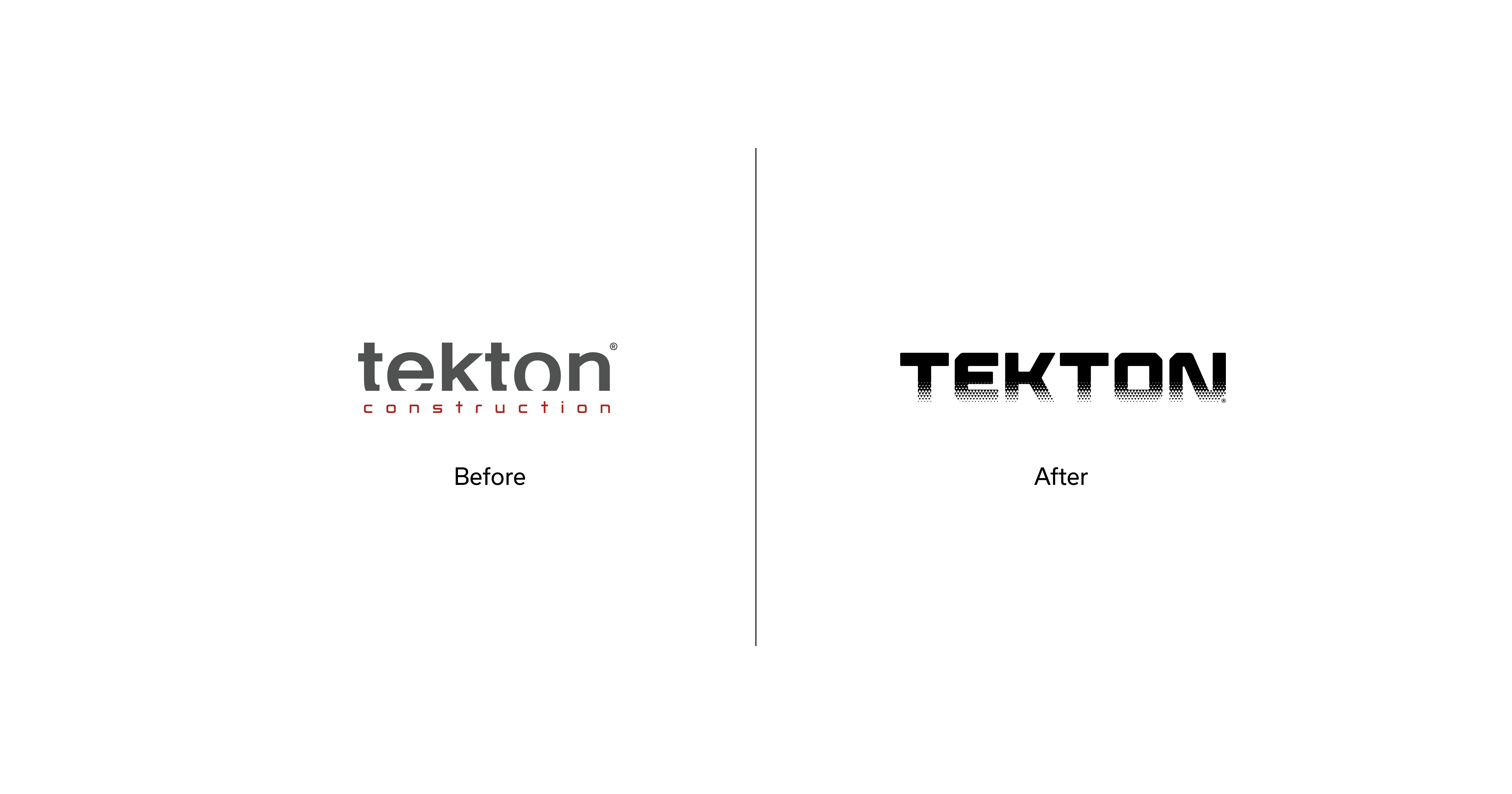
The existing Tekton logotype already contained an idea worth preserving. The lower part of its letter forms was cutaway, subtly suggesting a building in progress, a structure rising from its foundations.
We decided to build on that idea.
Rather than making a radical break froman identity that had built recognition over the years, we chose evolution. We clarified the original concept and used it as the foundation for a stronger, more contemporary visual system.
Approach
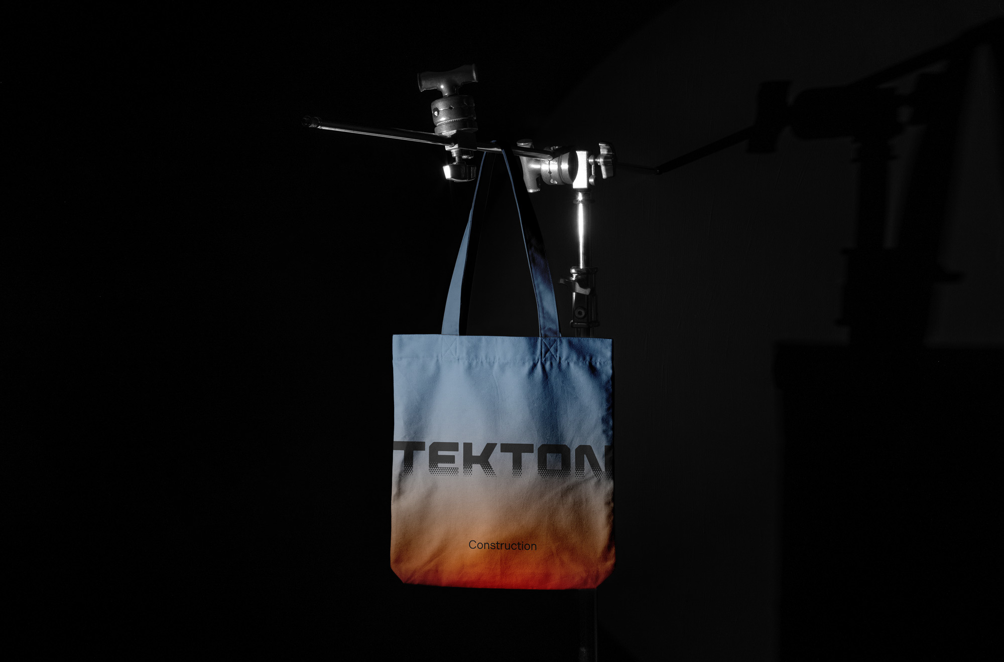
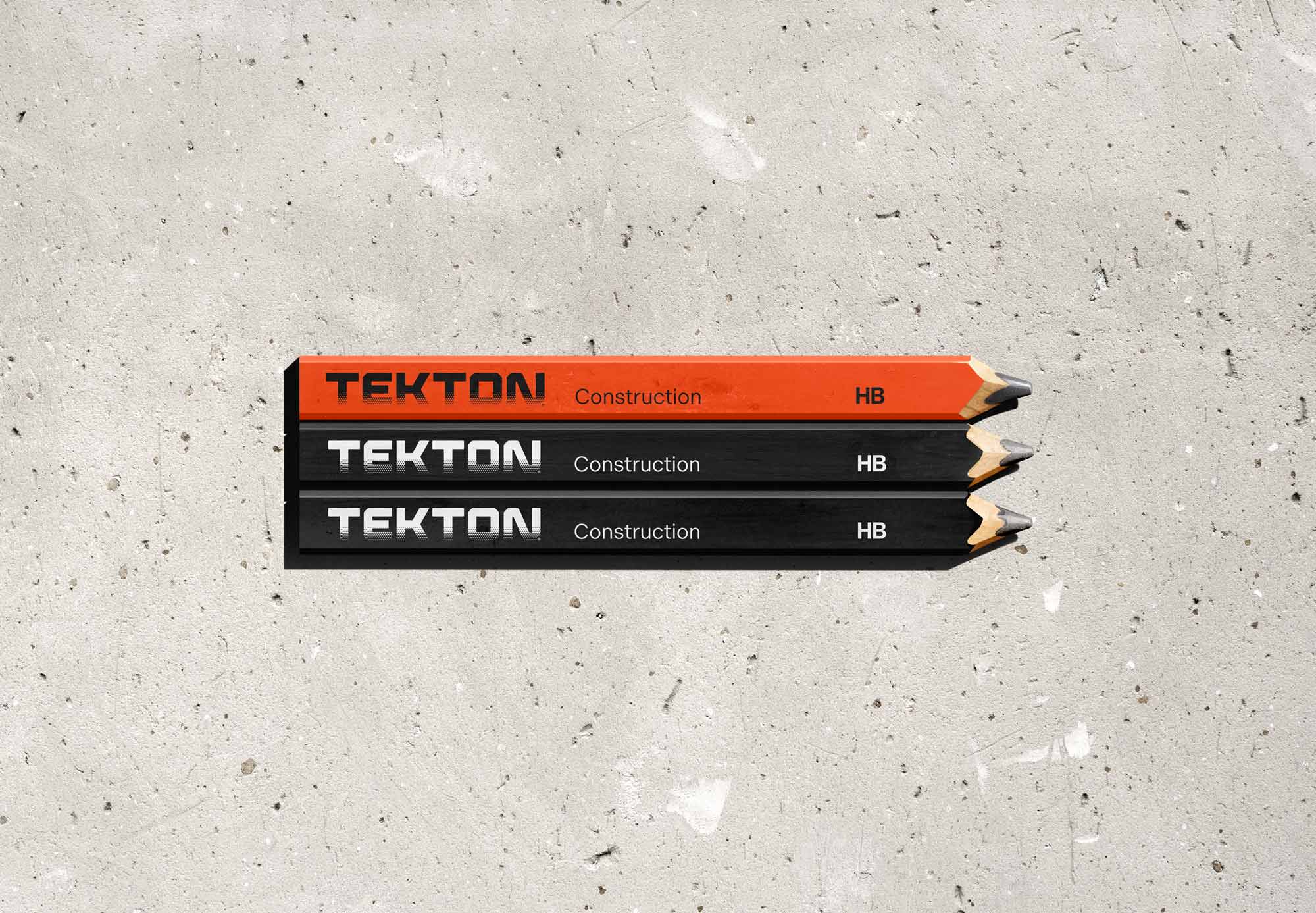
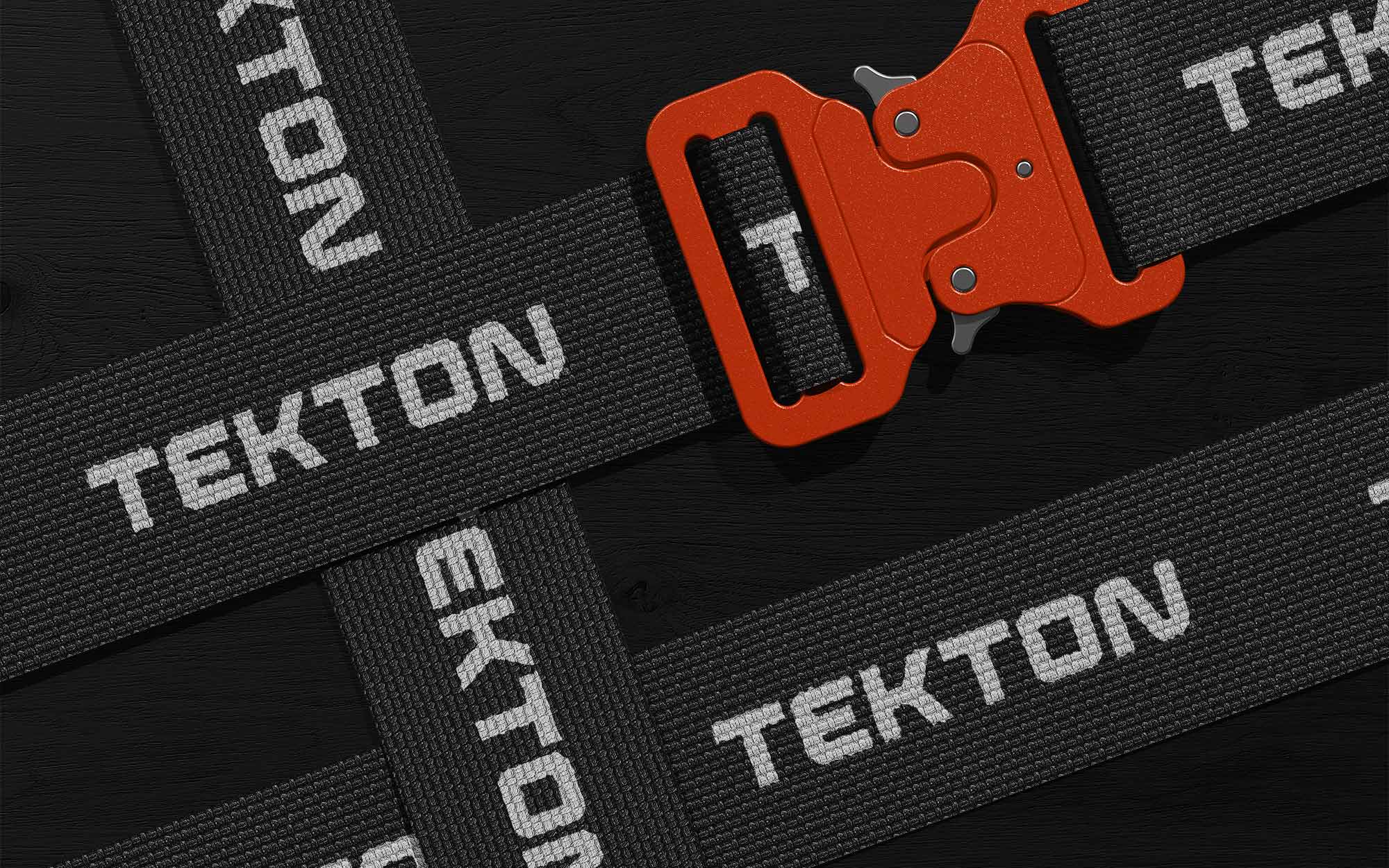
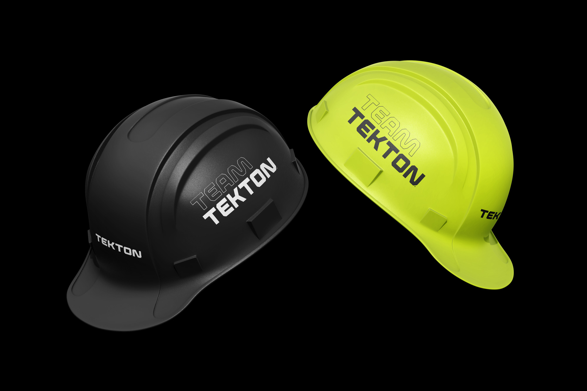
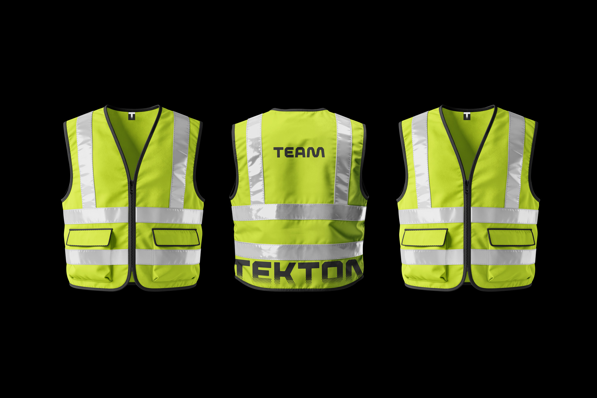
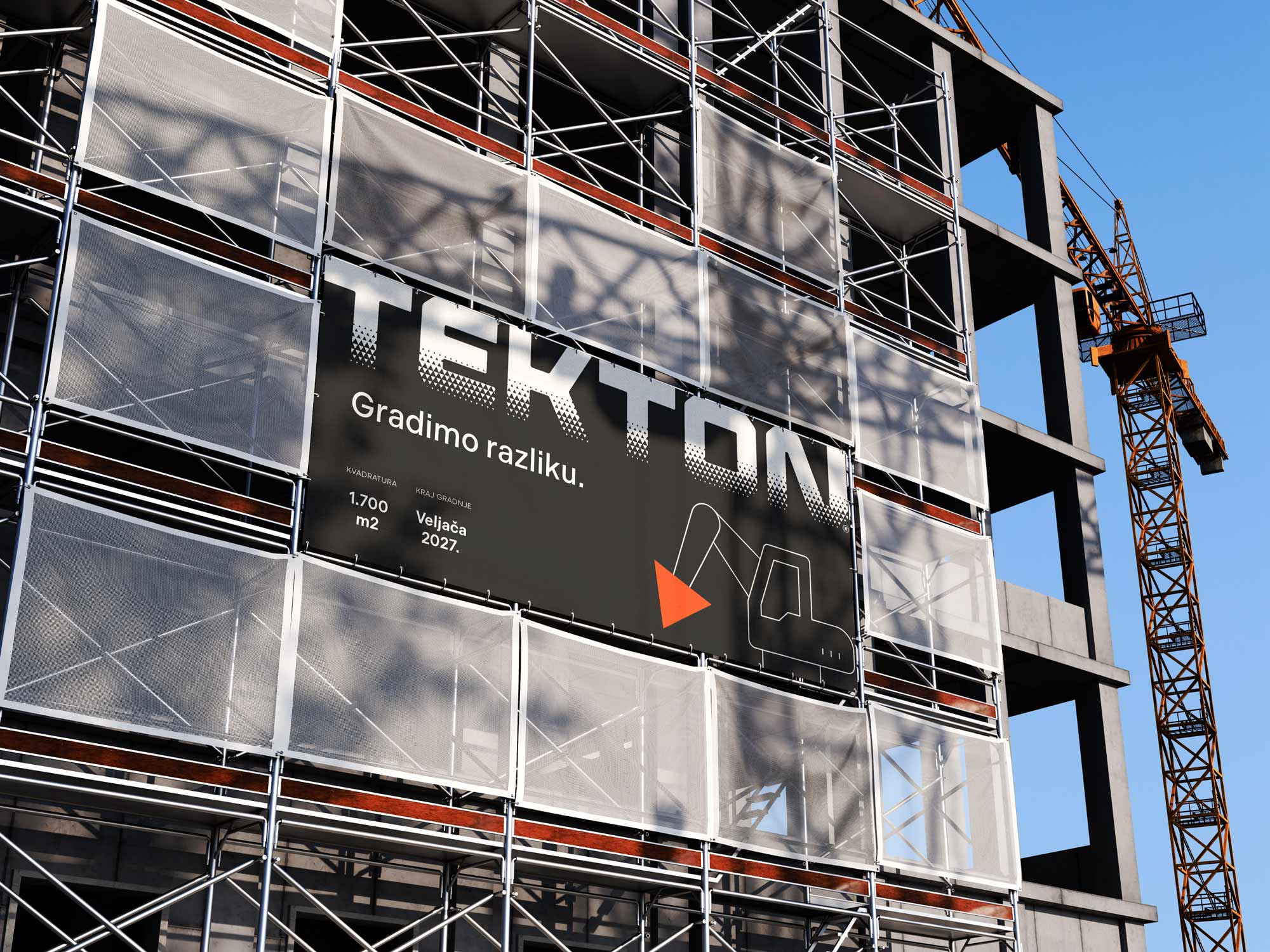
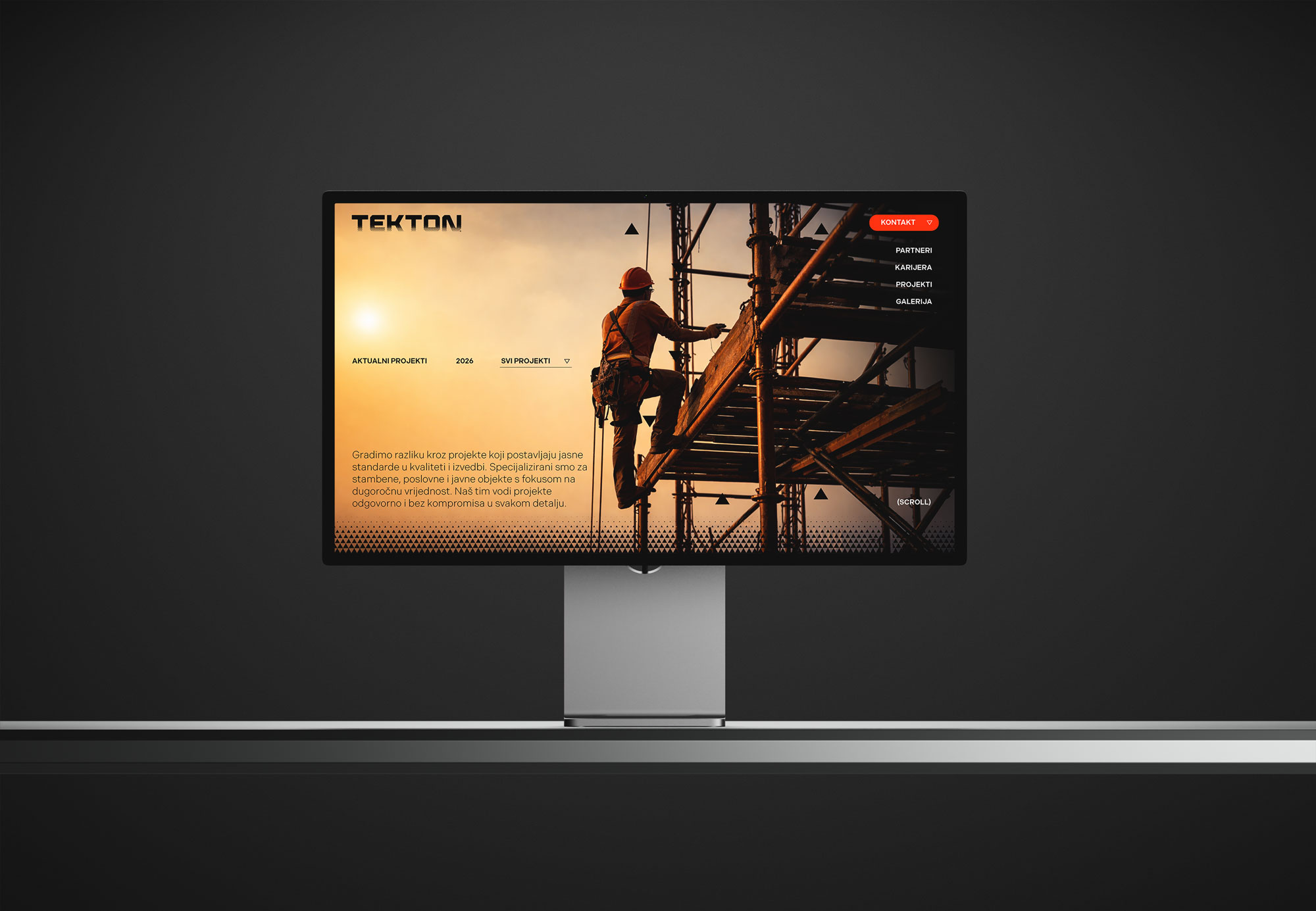
The new typographic logotype retains the idea of a structure rising from its foundations, but expresses it with greater precision and presence. A completely new typeface gives the identity a stronger character, while a triangular texture emerging through the lower section of the letters reinforces the sense of construction and formation.
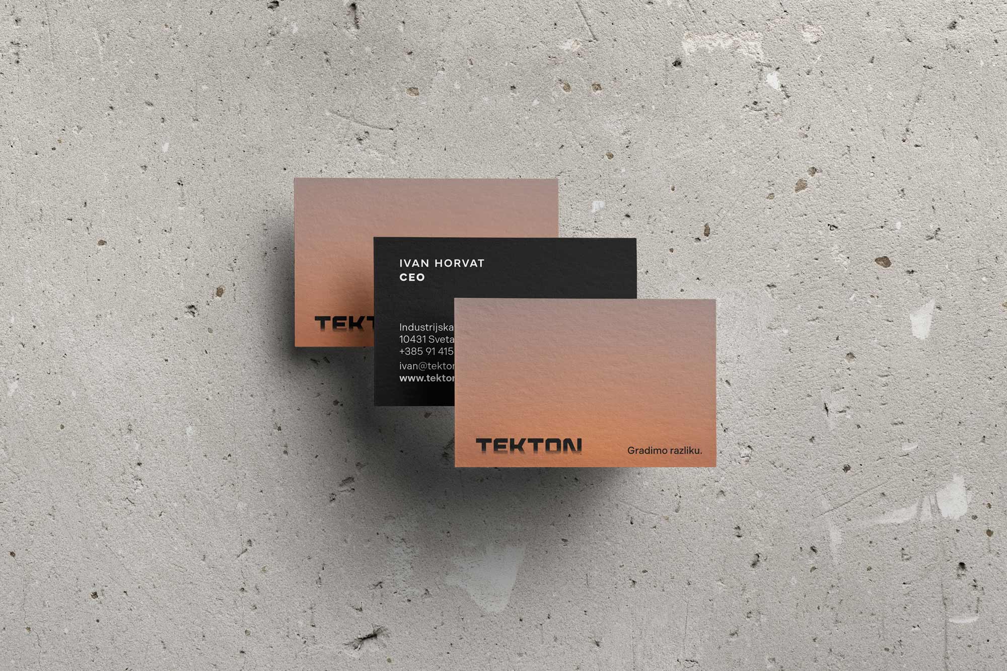
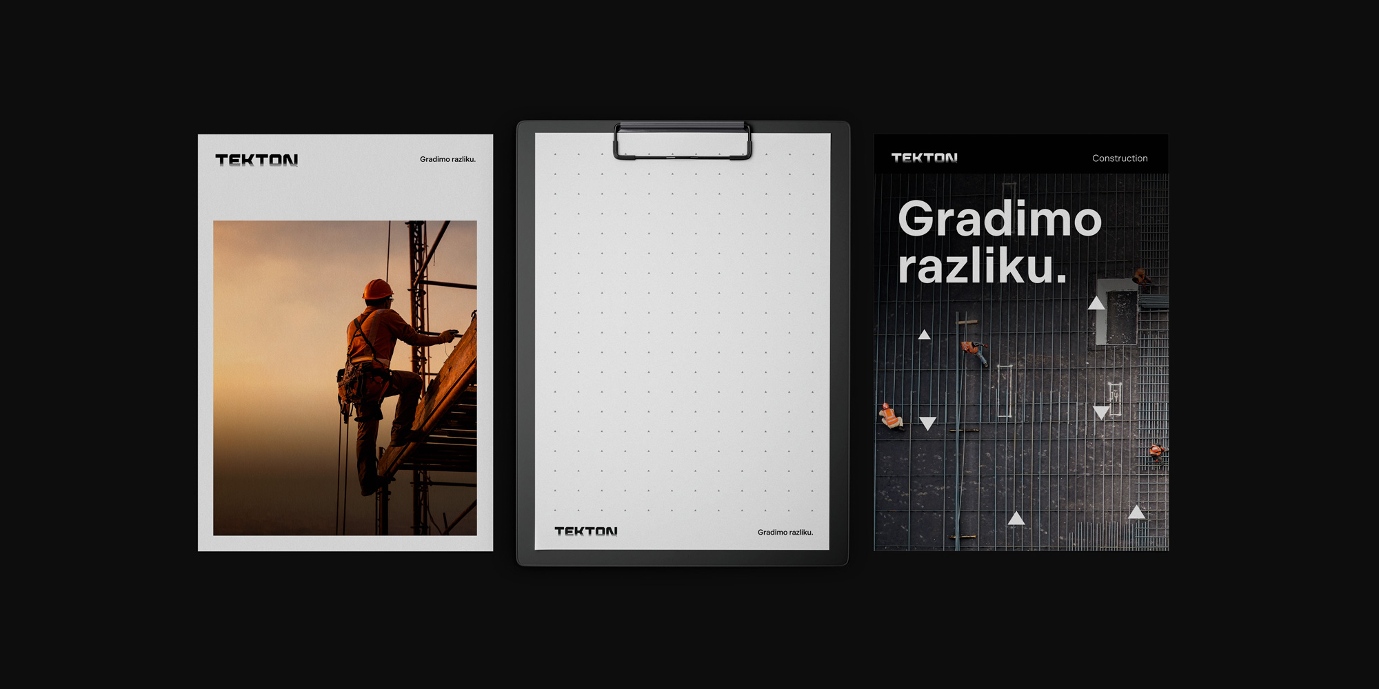
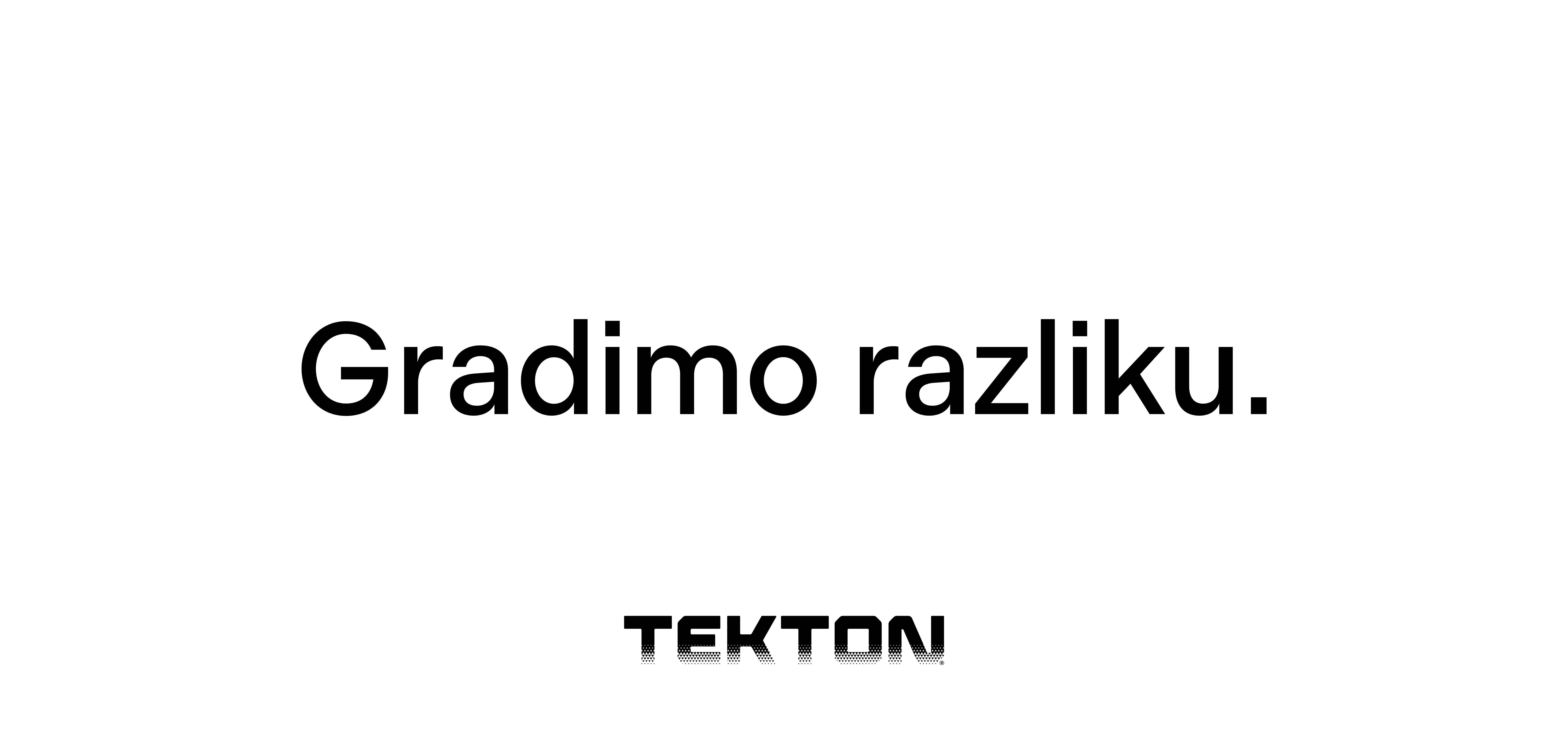
Alongside the visual identity, we developed a new brand slogan: Gradimo razliku.
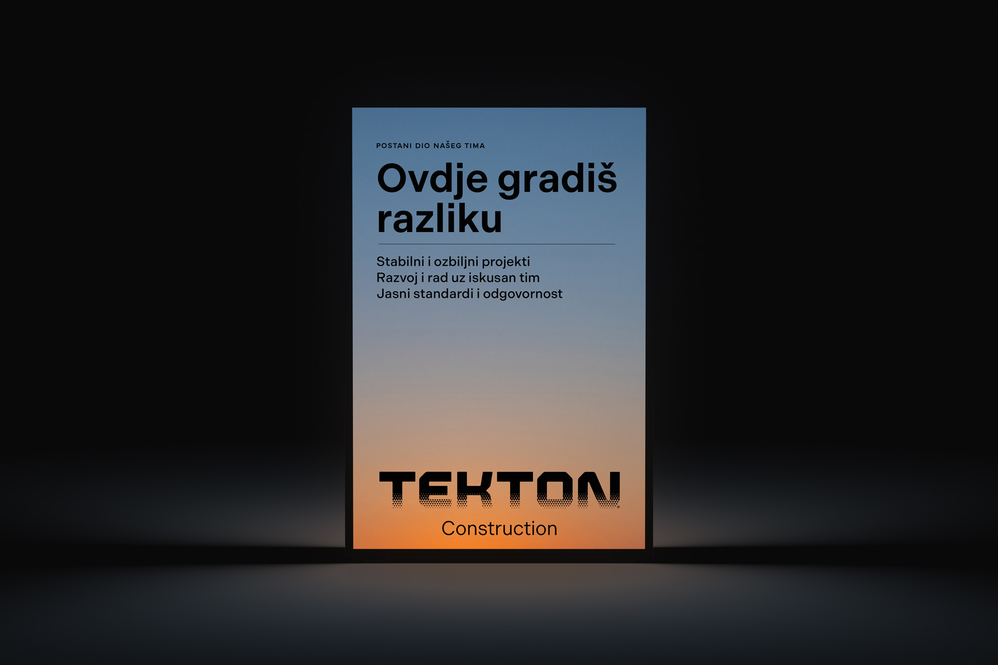
It is based on the familiar Croatian expression radimo razliku, meaning making a difference. By adding a single letter, the phrase becomes specific to Tekton: Gradimo razliku translates as We build a difference. It speaks directly to construction while expressing a broader ambition to raise standards and create lasting value through every project.
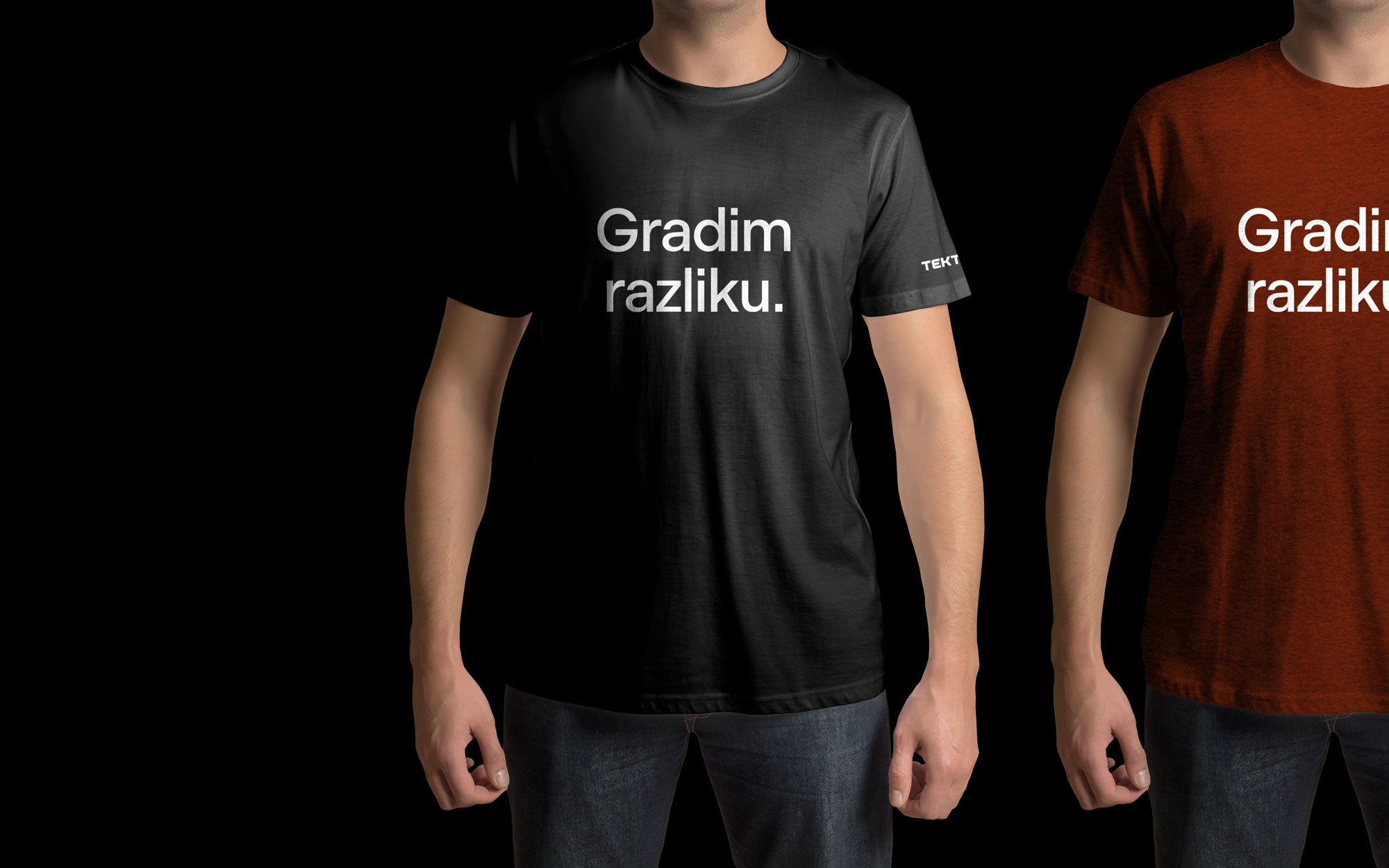
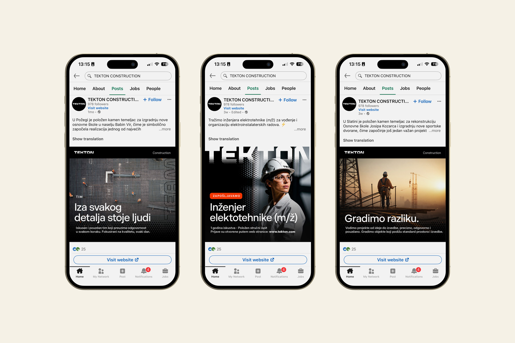
The message was designed to work externally as well as within the company. Across T-shirts, workwear and internal communication, Gradimo razliku. becomes a shared stateent for the Tekton team and a natural part of its employer branding.
The triangle from the logotype became one of the defining elements of the wider visual language. As a geometric form associated with stability and structural strength, it belongs naturally to the world of construction. Developed across textures, grids and icons, it creates a consistent visual thread throughout the identity and connects its many applications into one recognisable system.
Alongside this precise geometry, we introduced the visual motif of sunrise. Construction is inherently future-facing, and the appearance of light on the horizon became a subtle metaphor for new beginnings, progress and continuous development. It also brings warmth into the identity, giving the brand a distinctive atmosphere beyond its technical character.






Results
The new Tekton identity was conceived as a natural continuation of what came before, rather than a break from it.
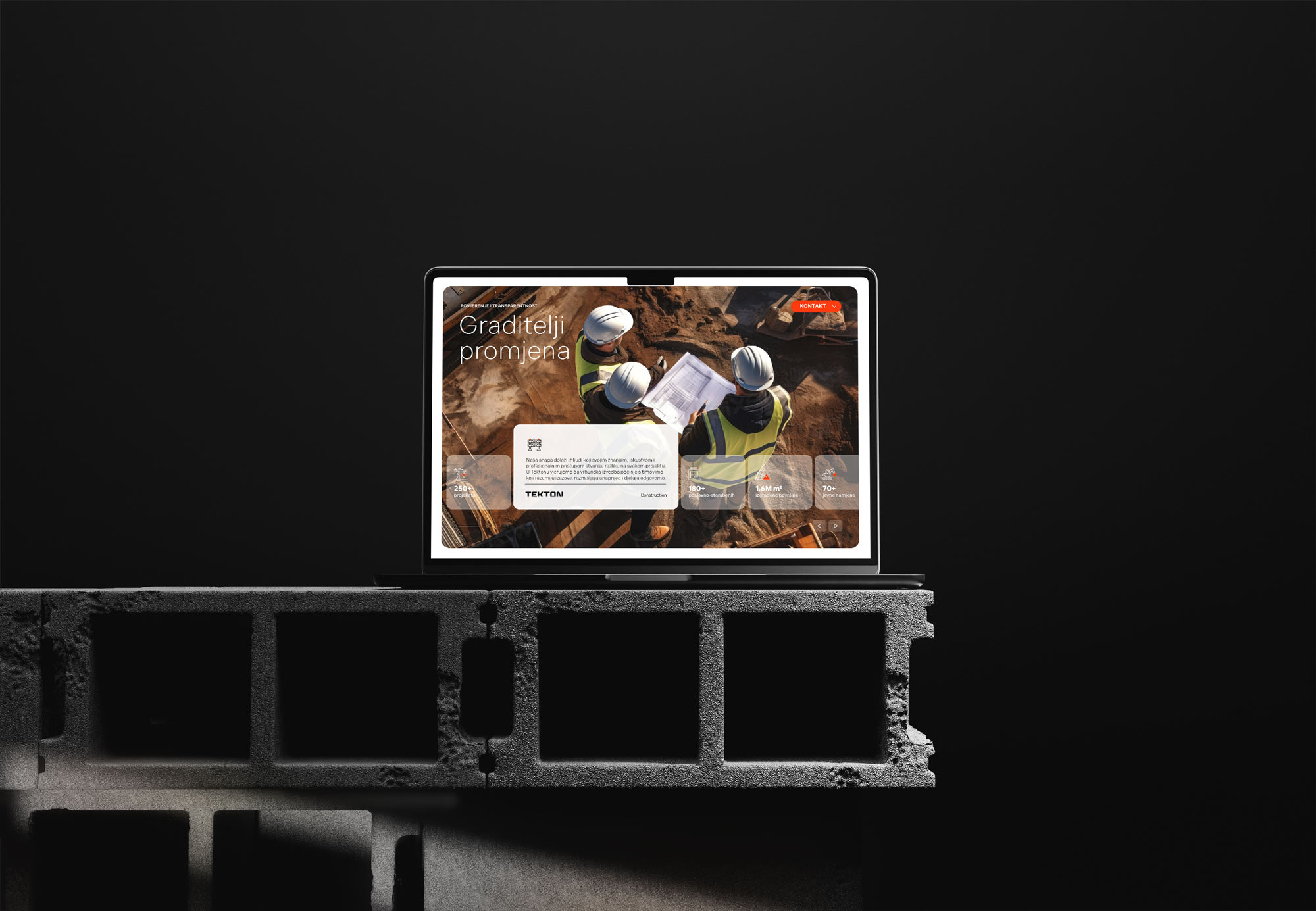
From the logotype and construction sites to corporate materials, digital channels and team communication, we created a complete brand system that reflects the scale, experience and ambition of the company while giving it a clear contemporary expression for its next stage of growth.
Because in branding, as inconstruction, what comes next depends on the foundations you build on.
Gradimo razliku.
More work


